
Booty Slap Card Game pt4

Booty Slap Card Game pt3

Booty Slap Card Game pt2
More work from a game I worked on.

Booty Slap Card Game Preview
Here’s some pieces I did for a card game I did called Booty Slap.

Sugar and Spice Process
Here's the process I went through for my Sugar and Spice Pin up I recently did.

For this pin-up, I wanted to portray a Bettie Page type character with a bondage theme, but keep it a little more light-hearted. After going through a few roughs I came across the idea of having her come out of a bondage themed cake and ended up with the rough below.

So as you can see, the final didn't change all that much from the rough. The main critique I received was about the cake. A friend pointed out that the layers should be switched so that there is more of a visual rest between the model's stocking and the ones on the cake. They also recommended adding a shibari pattern to break up the layer with the ball gag and straps.

For the final line work, I switched the cake layers, redesigned the ball gag layer with the shibari design, added a bow to the stocking layer to break up the lines, shifted the model's pose slightly to center her a little more, and added some detail to the model's outfit.

Finally, I scanned the pencils, printed them out in blue line and inked the piece. There weren't too many changes from the final pencils besides leaving out some of the details that would look better being added digitally. Once the inks were done, I scanned them in, cleaned up the lines in Photoshop and colored it.
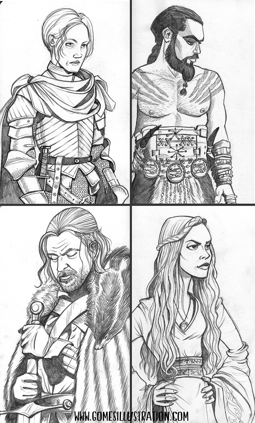
Game of Thrones Sketches
Since the premiere of this season's Game of Thrones, I've been filling my sketchbook up with sketches of my favorite characters.
Rise: Comics Against Bullying
Recently I had the pleasure of working with comic writer, Kristopher White, on a short story called "The Crystal Ball" for a comic anthology. Rise: Comics Against Bullying is a multi-issue anthology comic book series written and drawn by a collection of established names (such as Mark Guggenheim and Jed Dougherty) along with up and coming artists. This anthology focuses on the issue of bullying and aims to spark conversation and provide resources for at risk youth in an accessible and engaging format. Additionally all profits of the comic series go to organizations such as GLADD, Prism Comics, and Stand for the Silent.
Right now there are two volumes of the series (The story I worked on can be found in the second volume) and they can both be picked up at Northwest Comics at: http://northwestpress.com/shop/rise-comics-against-bullying-2/.

Pinocchio and Fox Character Studies
Here are a few character studies for Pinocchio and the Fox that never made it onto the site.


Sketch Dump
Here's a collection of random sketches/doodles taken from my sketchbooks.


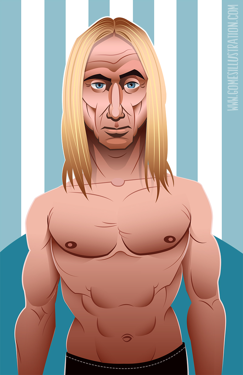
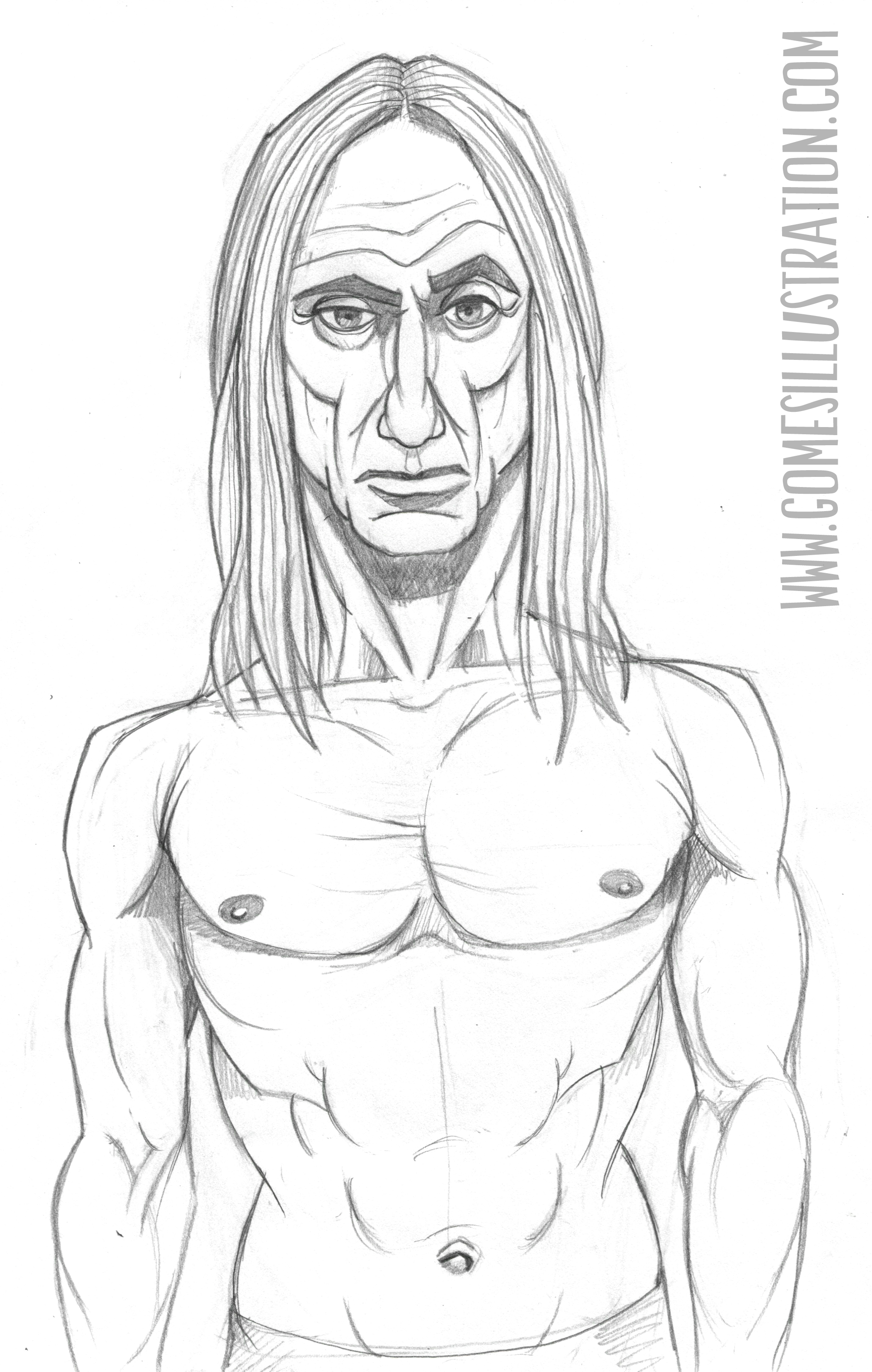
James Newell Osterberg, Jr. or just Iggy Pop
Here's a new vector piece I did of Iggy Pop. I'm a big fan and I've always wanted to do a portrait of him. I'm planning a few more portraits of this style so keep an eye out. Below is the pencil sketch.
The Conquistador and the War Rat
I went through my archives and found some older pieces that I realized had never been posted to the blog yet, so here you go.

Conquistador - Pencil 2012

War Rat - Pencil 2012

Birthday Buckaroos Licensing Preview
This licensing preview is focused on a cowboy themed birthday card set. The set will have 4 cards in total, each with their own classic cowboy pose.

Pinocchio Map Spread
Here is a final sample of a double page spread from the Pinocchio book I'm working on. I really wanted to go with a playful map-like feel for this spread.

Pirate Children Preview
Thought I'd share a preview of some older pirate characters I am reworking. I'm just about done with this one and have two more to get through.

Turtles!
Just some quick little turtles in vector.
Collection of Editorial Preliminary Work
Here's a handful of the preliminary work for some of my editorial pieces.

Drone Home Roughs

Drone Home pencils

Drone Home color roughs

At What Cost Roughs

Prescription Cover color roughs

Prescription Spread color roughs

Neymar study for Game Changer

Drogba
Here's a vector illustration of a barbarian character I recently came up with.

Bill Burning Possum Illustration
Here is an illustration assignment incorporating three things we were told by another classmate. Mine were possums, hiking in the woods, and an utter hatred for paying bills.
Pinocchio Cover and Process
So for today, I’ll be going through the basic process of how I go about doing my illustrations. Seeing other artist’s processes always interests me and I usually find little tips that influence my own work so I hope that any of this will help you out.

Today I have a cover I did of Pinocchio and since this is a well known story, the first thing I did was go ahead and reread the book . When dealing with existing stories I find it really helpful to do my research before I start sketching out ideas being how the better you know your subject, the more concepts you can pull from. Next I go into doing a page or two of very rough drawings (that usually only I can make out) in order get everything that is going through my head out on paper. From these scribbles I pick about three or four that work best for the piece and do some slightly cleaner roughs for them like the ones below.

In this case the first rough with Pinocchio on the workbench was the favorite, but the other doll heads were confusing and I needed to zoom in just a little more so that Pinocchio is more of the focus. Also I wanted to add in some very subtle details of what goes on within the story with what is pictured on the shelfs. So I took the critiques and went along to my next step of doing a more finished pencil drawing with the changes. I added wood carvings of the fox and the blind cat to represent the characters and a varnish bottle entitled “hangman’s varnish” to represent what they did to Pinocchio.

At this stage I scan in the pencil drawing and I usually do a couple quick colored versions in Photoshop just to play around with what options I have, but since I already had a specific color palette in mind I went straight into Illustrator. In Illustrator I start up a new document of the appropriate size and place the pencil drawing on it’s own layer. I knock down the opacity to around 30-40% depending on how strong the lines are so it doesn’t get confused with what I’m doing in Illustrator and I start blocking in the shapes in greyscale. The reasoning for starting in greyscale is so that I can just focus on getting the shapes and lines exactly how I want them to be without worrying about color. It’s also easier to add color later on being how I have the values completely worked out.

From here all that’s left is to make some corrections, add the colors, and the finishing touches. I added the spotlight on Pinocchio in order to push back some of the items on the shelf and make sure that he is the main focus of the cover and I redid the books with more detail being how they seemed a little too cartoony to me. Lastly, I found a font that worked well with the illustration and added in the title and author credit.
